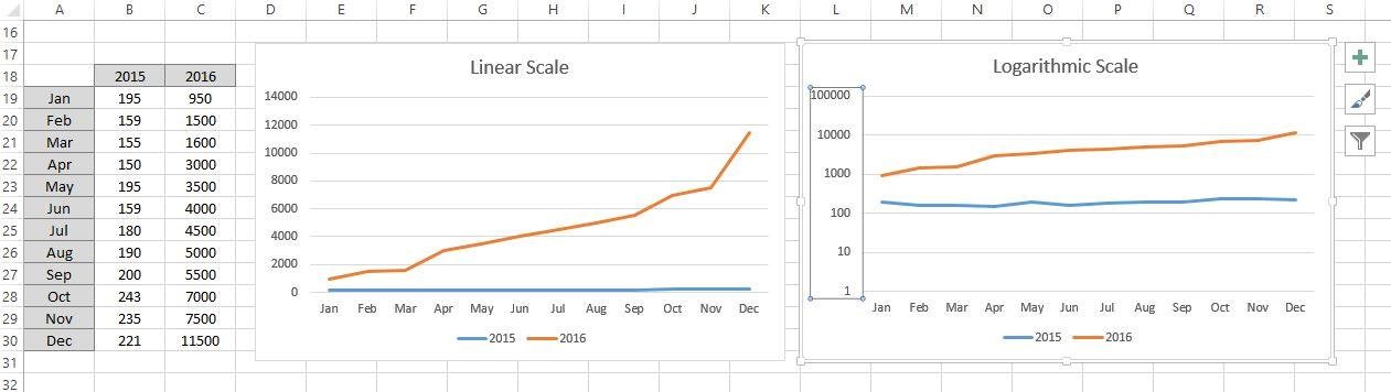
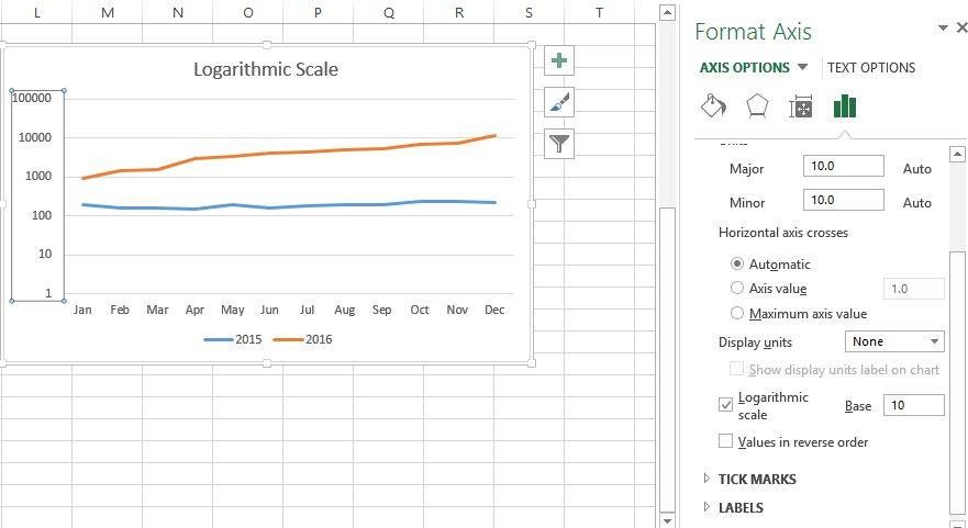
တန်ဖိုးကွာခြားမှုများနေတဲ့ data series နှစ်ခု ဥပမာ အားဖြင့် ပြီးခဲ့တဲ့နှစ်ရောင်းအားနဲ့ ယခုနှစ်ရောင်းအားက ရာပြည့်နဲ့ ထောင်ပြည့်ကိန်းများအထိ ကွာခြားနေတဲ့ အခါမျိုးမှာ Y Axis scale ကို Linear Scale နဲ့ပဲ ပုံမှန် ဆွဲလိုက်မယ်ဆိုရင် ပုံ၁ မှာလို 2015 က X axis နားကို ကပ်နေပြီး ရှင်းရှင်းလင်းလင်းမမြင်နိုင်တော့ပါ။ အဲလို အချိန်မျိုးမှာ scale ကို Logarithmic Scale ကို ပြောင်းလိုက်မယ်ဆိုရင် ပုံ ၂ မှာ ပြထားသလို 2015 ရော 2016 ကိုရော ရှင်းရှင်းလင်းလင်း မြင်နိုင်ပါတယ်။
Logarithmic scale ကို ပြောင်းမယ်ဆိုရင် Y Axis ပေါ်မှာ right click နှိပ်ပြီး Format Axis ကို ရွေးပါ။ Format Axis pane မှာ Axis option အောက်မှာရှိတဲ့ Logarithmic scale box ကို check လုပ်ပြီး Base မှာ 10 ကို ထားပါ။
When drawing a chart for 2 or more data series which has large data gap, we need to use logarithmic scale instead of linear scale. First chart is with linear chart, 2015 data and 2016 data spread in large gap, so, 2015 data is not significant to view. Second chart is with logarithmic scale, the interval between the Y-Axis is based on value of 10s. So, 2015 data is significant to view. To change the Y-Axis to logarithmic view, right click the Y-Axis and choose Format Axis. In the Format Axis pane, under Axis options, turn on the Logarithmic scale box with value base 10.