Category: MS Excel

Notes on MS Excel

Time format that effects the value

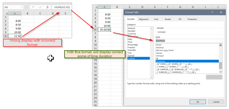
When adding the time values in range, such as total working overtime hours for employees, and it is needed to format as [h]:mm:ss. Otherwise, although the total hours is more than 24, it will stuck to 24 and could not be able to show the actual values. If is not the summation errors. It is just a formatting error. အချိန်နဲ့ ပတ်သက်တဲ့ data cell တွေကို ပေါင်းတဲ့အချိန်မှာ date data cell များရဲ့ time Read more Time format that effects the value

Trend Function

Excel ရဲ့ Function တစ်ခုဖြစ်တဲ့ Trend function က Sales Trend လို data လို တစ်ခုရဲ့ လက်ရှိရှိနေတဲ့ ၆လ၊ ၁၂လ စတဲ့ data တွေကို အခြေခံပြီး နောက် ၆လ မှာ ဖြစ်နိုင်တဲ့ data ကို ခန့်မှန်း တွက်ထုတ်တာပါ။ ဒီ function က Sales Target တွေကို planning Read more Trend Function

FV Function

Excel ရဲ့ FV function (Future Value) ငွေချေးတာ ငွေစုတာတွေမှာ စမတည် တန်ဖိုး၊ အတိုးနှုန်း၊ ချေးငွေ/စုငွေကာလ သက်တမ်း၊ လစဉ်ပေးသွင်းငွေ စတာတွေ ထည့်ပေးလိုက်ရင် သတ်မှတ်ကာလ အပြီးမှာ စုစုပေါင်း Read more FV Function

Logarithmic Scales

တန်ဖိုးကွာခြားမှုများနေတဲ့ data series နှစ်ခု ဥပမာ အားဖြင့် ပြီးခဲ့တဲ့နှစ်ရောင်းအားနဲ့ ယခုနှစ်ရောင်းအားက ရာပြည့်နဲ့ ထောင်ပြည့်ကိန်းများအထိ ကွာခြားနေတဲ့ အခါမျိုးမှာ Y Axis scale ကို Linear Scale နဲ့ပဲ Read more Logarithmic Scales

Vertical Axis to 0

တခါတလေ category တစ်ခုနဲ့တစ်ခုရဲ့ data ကွာခြားတာဟာ အရမ်းတာဟာ အရမ်းသေးငယ်တဲ့ တန်ဖိုးတွေ ဖြစ်နေတတ်ပါတယ်။ ဉပမာ Jan ရောင်းအားက 50, Feb ရောင်းအားက 50, Mar ရောင်းအားက 51 ဖြစ်နေတာမျိုးပါ။ ဒီလို data မျိုးတွေ ကို Read more Vertical Axis to 0

Bar chart

Chart တွေ ဆွဲကြမယ်ဆိုရင် အများအားဖြင့် ရွေးချယ်ကြတာတော့ column chart တွေပါပဲ။ ဒါပေမယ့် တချို့ ပုံတွေမှာ column chart အစား bar chart ကို သုံးပြီး ဆွဲတာက ပိုပြီးသင့်တော်ပါတယ်။ နံပါတ် ၁ အချက် က data points တွေ Read more Bar chart

Display current and target in one line (Line Chart)

တခါတလေမှာ Chart ရဲ့ Line တစ်ခုထဲမှာ လက်ရှိ တစ်နှစ်စာ trend data ကို နောင်လာမယ့် 6လ forecast နဲ့ တွဲပြီး ပြချင်တာမျိုး ရှိပါတယ်။ ဒီပုံစံမျိုး ပြဖို့အတွက် data ပြင်တဲ့အခါမှာ လက်ရှိ 12 လ (Jan ကနေ Dec) အထိကို A2 ကနေ A13 Read more Display current and target in one line (Line Chart)

Gantt Chart in Excel

Gantt chart ကို သုံးပြီး project time span ကို ပုံနဲ့ ဖော်ပြနိုင်ပါတယ်။ လက်ရှိမှာ project plan ကို ဖော်ပြတဲ့ tool တွေ အများအပြား ရှိနေပေမဲ့ Excel ကို သုံးပြီးလဲ အလွယ်တကူရေးဆွဲနိုင်ပါတယ်။ ဥပမာ။ ။ အဆင့် ၆ဆင့် ရှိတဲ့ Read more Gantt Chart in Excel

Bullet Graph

Bullet Graph က target နဲ့ actual value ကို rating points တွေနဲ့ ဖော်ပြတဲ့ အချိန်မှာ အသင့်တော်ဆုံး ဖြစ်ပါတယ်။ ပုံမှာ ပြထားတဲ့ ဥပမာမှာ ရောင်းအားရဲ့ ရာခိုင်နှုန်းပေါ်မူတည်ပြီး Poor, Fair, Good နဲ့ Very Good ဆိုတဲ့ rating point လေးမျိုး Read more Bullet Graph

Thermometer Chart

Target နဲ့ Actual Sales Trend KPI ဖော်ပြတဲ့ chart တွေမှာ Thermometer Chart နဲ့ ပြမယ်ဆိုရင် ပိုပြီး မြင်သာပါတယ်။ Excel ရဲ့ Cluster Column Chart ကို သုံးပြီး Thermometer Chart ဖြစ်အောင် ဆွဲလို့ ရပါတယ်။ ပုံမှာ ပြထားတဲ့ Target နဲ့ Actual ရဲ့ Jan ကနေ Dec အထိ sales range Read more Thermometer Chart